Machine operator on factory floor
Interface Inventory and Functional Mapping Matrix

Fortra

Enterprise UX Design & Cloud Migration Strategy

Role: Pragmatic Lead UI/UX Design Engineer & Frontend Prototyper

Context: Enterprise Cloud Migration

1. The Situation

Fortra launched a high-stakes, one-year cloud migration to transition JAMS—its enterprise IT workload automation platform—from a legacy desktop application to a modern React web interface. At the same time, the business wanted to create a more consistent user experience across its product portfolio to support a broader platform strategy and customer upselling.

The project had significant challenges across design and engineering. The central corporate design team was working through a slow, committee-driven process that made it difficult to provide the volume of design support the migration required. Meanwhile, the development team was working under a tight engineering timeline and was prepared to move forward without UX involvement if necessary.

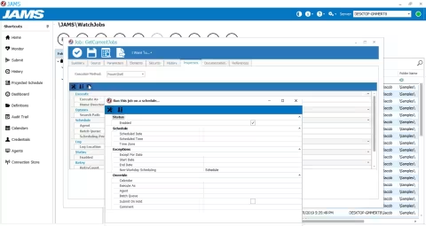
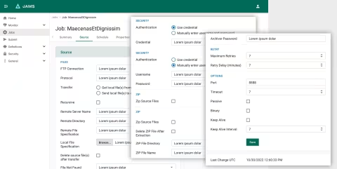
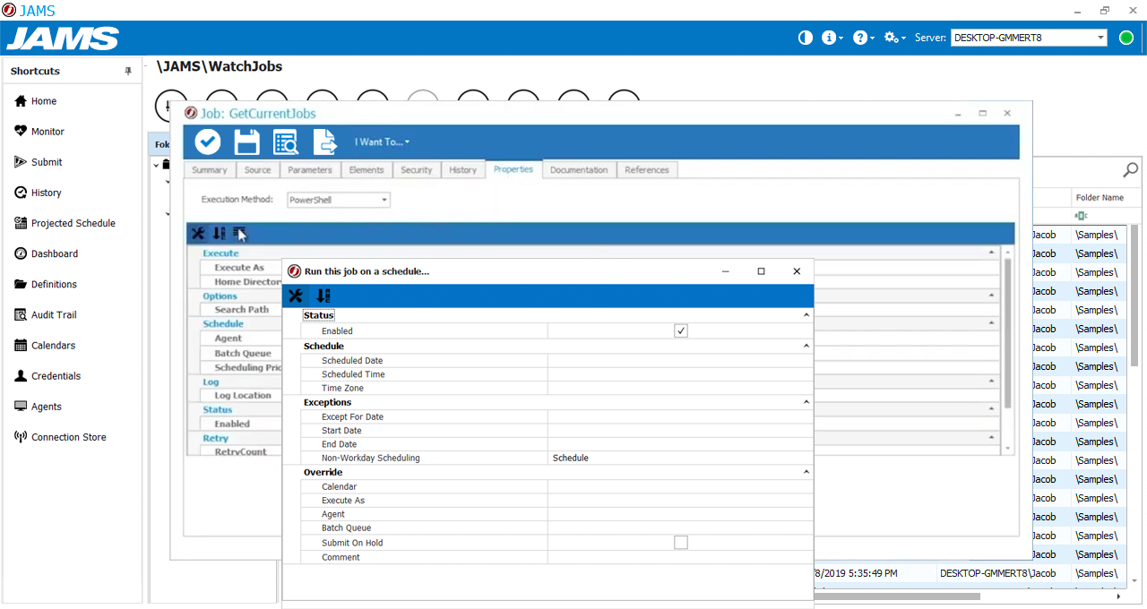
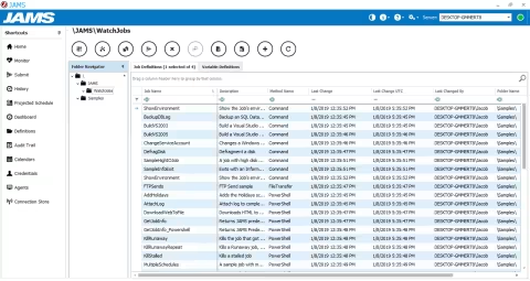
The product itself presented another challenge. Years of desktop-oriented design had resulted in deeply nested screens, inconsistent interaction patterns, and layers of modal windows that made complex workflows difficult to navigate. The migration therefore required more than translating existing screens into a web interface—it required rethinking how the product's workflows, navigation, and interface patterns could work together in a modern web application.
2. The Task

As the solo UI/UX Product Designer on the project, I was responsible for establishing a consistent, accessible foundation for the new web application while helping bridge the gap between the design and engineering teams. I brought both a design background and hands-on web development experience to the role, which allowed me to work through design and implementation questions together rather than treating development as a separate handoff.

I worked ahead of the engineering team to map end-to-end user flows, develop structural wireframes, and define reusable components and their interaction states. My goal was to give developers enough clarity to keep moving while still allowing the design to evolve as we uncovered technical constraints and workflow issues.

A key part of the role was building a productive working relationship with an internationally distributed engineering team. By staying closely involved with development and providing practical, developer-ready specifications, I could help resolve questions early, protect the usability of the product, and keep the work aligned with the team's delivery schedule.

3. The Action

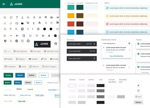
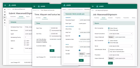
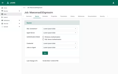
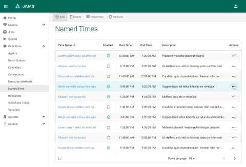
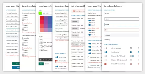
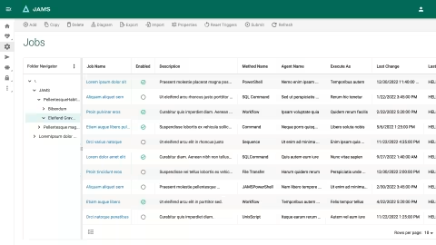
Established a practical component foundation. Rather than wait for the corporate design framework while development was already moving forward, I adopted MUI’s React-based Material Design system as a starting point. I adapted its components to the corporation’s typography and color requirements and established a product-specific set of reusable interface patterns.

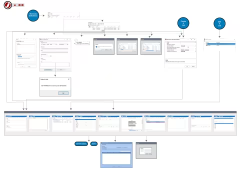
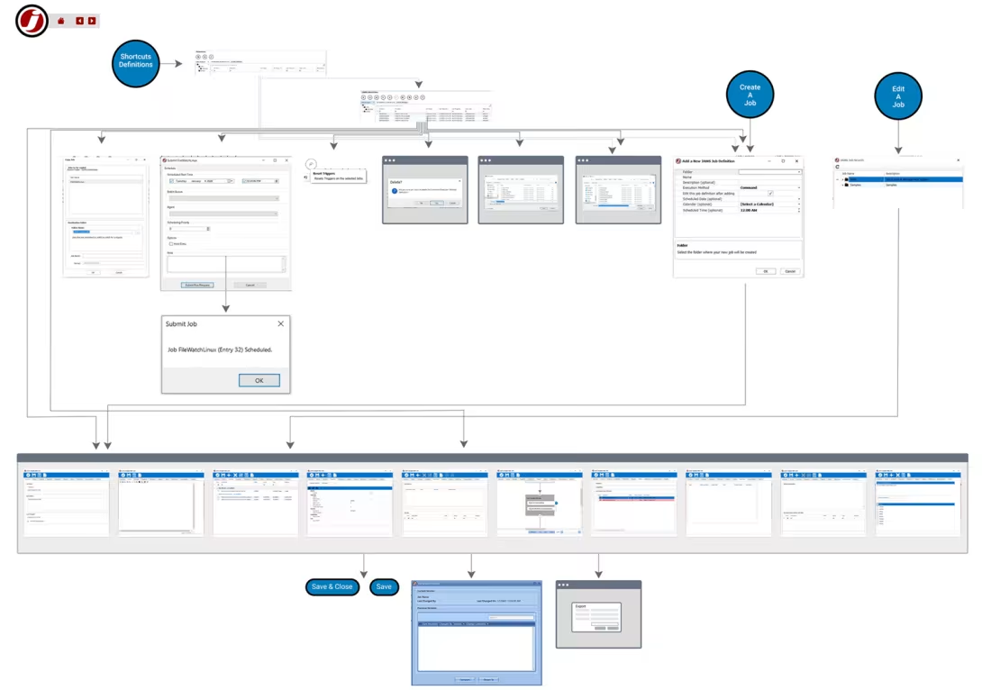
Mapped complex workflows before designing detailed screens. I conducted a structural review of the existing application and mapped end-to-end workflows using more than 15 large-format mapping matrices, along with low-fidelity wireframes. This helped identify unnecessary complexity and clarify how legacy workflows could be reorganized for the web before moving into high-fidelity design.

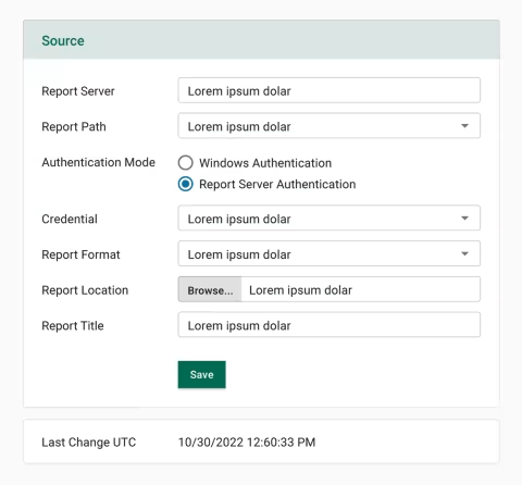
Worked directly with developers throughout implementation. I stayed closely connected to the engineering team and worked ahead of their sprint schedule. Using my front-end experience, I defined component states such as default, hover, active, and disabled in an isolated sandbox and provided HTML/CSS examples when they were useful for resolving implementation questions. This reduced ambiguity at handoff and allowed design and engineering issues to be addressed together.

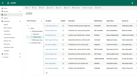
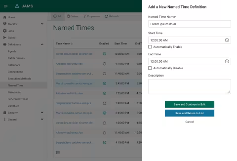
Reworked the workspace and navigation structure. The legacy application relied heavily on nested modal windows that made it difficult for users to maintain a sense of where they were. I replaced that approach with a more structured workspace using breadcrumbs for wayfinding and contextual slide-out drawers for configuration and related actions.

Designed for enterprise power users. When there was discussion about how much space to give data-grid rows, I considered the needs of users who work with large amounts of information at once. I designed the grid to support both looser and more compact row spacing, allowing users to choose the density that best supported their workflow and scanning needs.

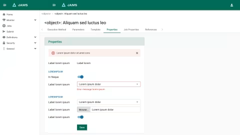
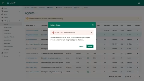
Designed for errors and alternate states, not just the ideal path. I replaced some of the legacy desktop interface’s cryptic graphics with clearer text-based navigation and supporting visual cues. I also mapped alternative input states, validation and error conditions, contextual pop-ups, and toast notifications so that the interface could communicate what was happening and help users recover when something did not go as expected.

4. The Result

The work produced a comprehensive web template architecture and mapped UI component library that gave the team a structured foundation for the planned cloud migration. I documented complete interaction states alongside full-screen layouts and established reusable patterns intended to bring greater consistency, accessibility, and predictability to a highly complex enterprise application.

Although the migration work was ultimately superseded by a later business decision to sell the JAMS product, the project gave me substantial experience working through complex workflows, establishing reusable interface patterns, and collaborating directly with engineering under significant time and organizational constraints.

The project reinforced the value of combining UX design with practical front-end knowledge. Rather than treating design as a static deliverable, I was able to work alongside developers, resolve implementation questions early, and create a clearer connection between user needs, interface behavior, and what the engineering team could realistically build.

The legacy design

The JAMS cloud migration required balancing three competing needs: corporate design standards, the technical constraints of a fast-moving React engineering team, and the workflow needs of experienced power users who were accustomed to the legacy desktop application.

The existing interface had grown around a desktop model, with deeply nested screens and layers of modal windows that made it difficult to maintain context while working through complex configurations. At the same time, the new web application needed a consistent visual and interaction language that could be implemented efficiently within the migration timeline.

I approached the redesign by working directly with engineering and using MUI as a foundation for reusable components and patterns. Rather than simply reproducing the existing screens in a web format, I reworked the workspace structure, replacing much of the modal-heavy interaction model with contextual drawers and clearer navigation. I also designed adjustable data-grid density to accommodate the scanning needs of experienced users.

The result was a more structured design foundation that connected visual consistency, accessibility, interaction behavior, and implementation considerations. The work was less about applying a new visual style and more about determining how a complex, established product could be reorganized into a more coherent web experience.

JAMS original screen with multiple popups.