women steel workers
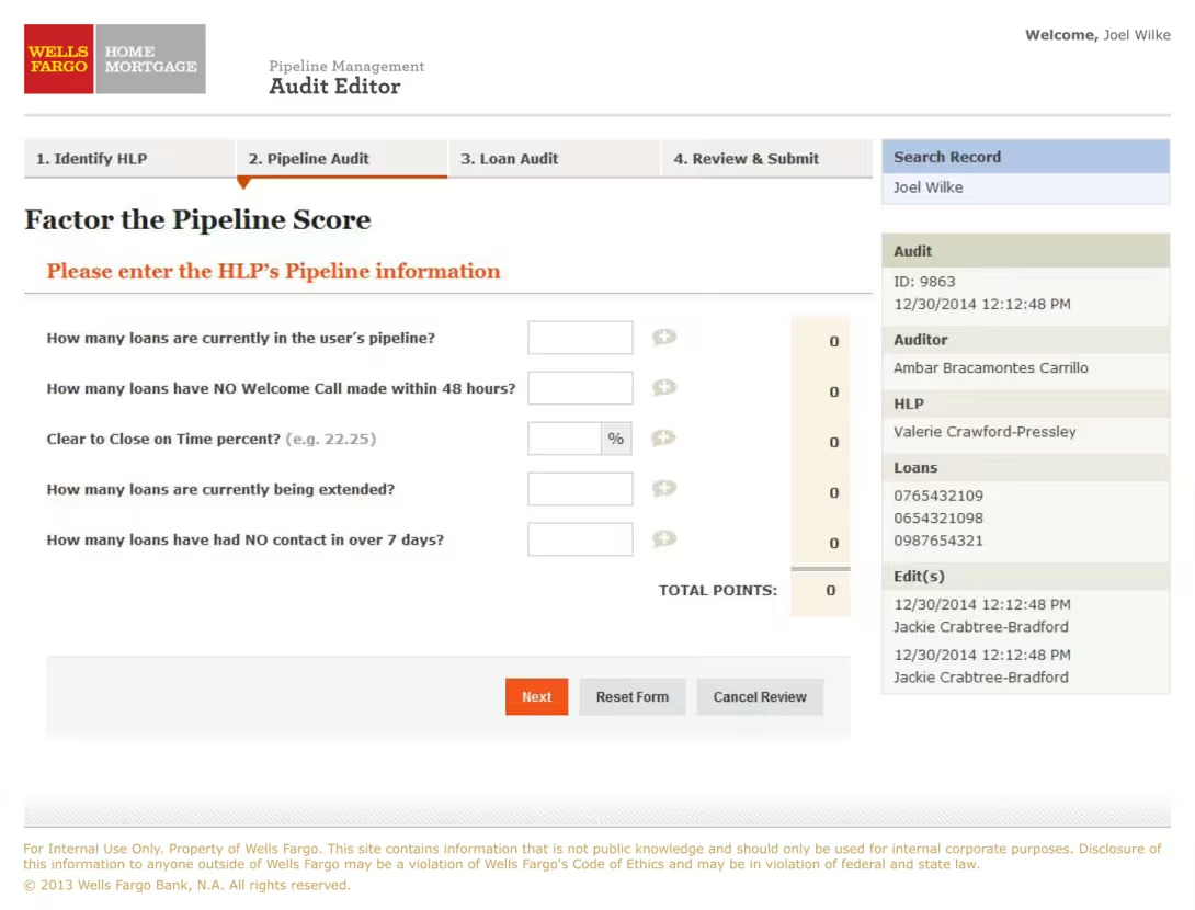
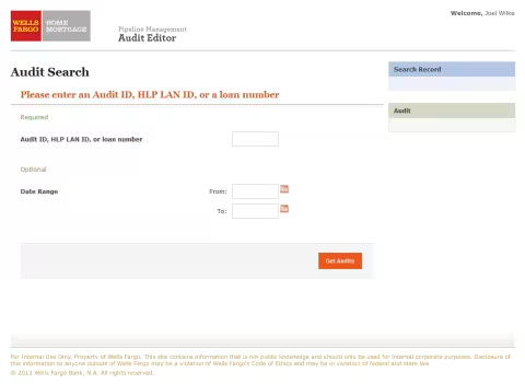
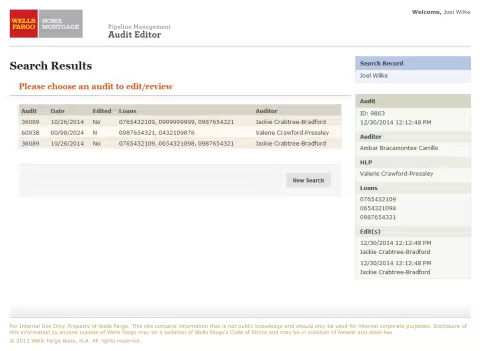
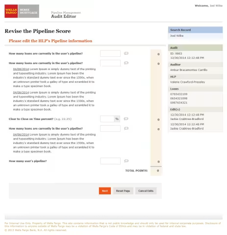
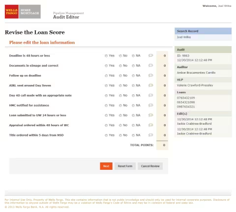
Audit Editor Tool-Factor the Pipeline Score screen

Wells Fargo Home Mortgage

Optimizing the Mortgage Pipeline

Role: Solo UI/UX Designer & Frontend Developer

Context: Internal Digital Transformation

1. The Situation

Wells Fargo Home Mortgage set a business goal of reducing the end-to-end mortgage process—from application through closing—to approximately 28 days. At the time, many of the internal workflows supporting that process were manual and fragmented.

Customer service agents and lenders relied on physical scripts during calls with applicants, recorded application information by hand, and then manually entered that information into separate legacy systems after the call. The process required information to be handled more than once, creating opportunities for data-entry errors and adding time to an already time-sensitive workflow.

The challenge was to replace this fragmented process with a more connected digital experience that could support agents while they were actively working with applicants.

2. The Task

As the solo UI/UX Designer, I was responsible for designing a unified internal web application that brought these workflows together into a clear, step-by-step experience. The goal was to allow agents to capture information directly in the application while speaking with mortgage applicants, rather than relying on handwritten notes and duplicate data entry.

I worked with cross-functional Business Analysts to understand the existing workflows, employee scripts, business requirements, and lending regulations. My role was to translate that complexity into an intuitive screen flow that could guide employees through the process while keeping the information they needed readily accessible.

Because the application was being developed as a reusable foundation, I also focused on establishing consistent templates, layouts, form patterns, and interaction conventions that could support additional mortgage-related products and workflows rather than designing each screen as an isolated solution.

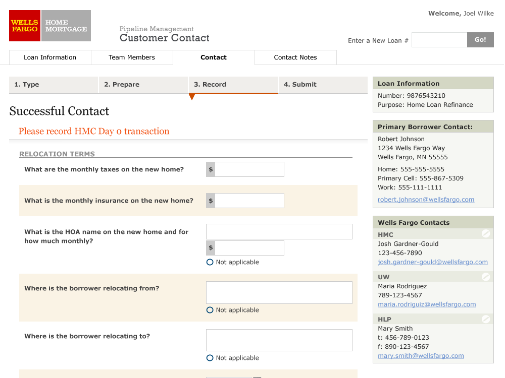
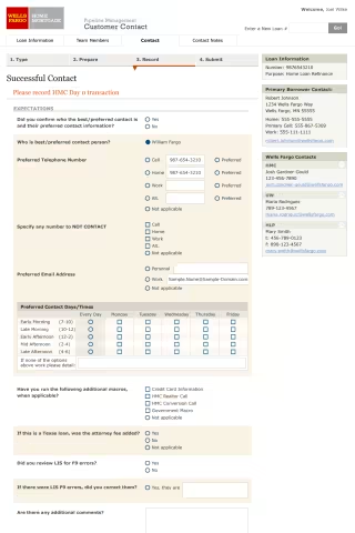
Customer Contact Tool - Successful Contact form screen
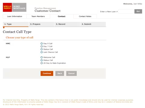
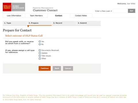
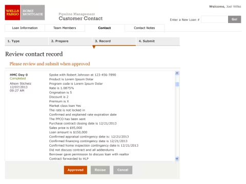
A data recording step screen during customer contact

3. The Action

Established the visual foundation with the corporate design team.
Because the internal application needed to align with the broader Wells Fargo brand, I partnered with the consumer-facing design team in San Francisco to understand and translate their brand guidelines. I adapted those visual standards for a very different environment: dense, information-heavy internal software where employees needed to process large amounts of information quickly.

Built a reusable web template from scratch.
Using my web development background, I created the foundational template for the application rather than designing each page independently. I established consistent page structure, typography, spacing, color, and layout behavior so that new screens could be built within a predictable framework. Particular attention went to vertical rhythm and how the layout behaved as pages grew dynamically, including how elements such as footers and form content expanded without disrupting the overall structure.

Designed for the call-center environment.
The application was used by agents working through mortgage applications while simultaneously speaking with customers on the phone. I designed the workflow around that context, breaking complex forms into smaller steps and reducing unnecessary visual complexity. A restrained color palette and clear visual hierarchy helped keep the interface readable during extended periods of use, while high-contrast action buttons made the next step apparent without requiring users to constantly scroll through a long form.

Designed error states and alternate paths alongside the primary workflow.
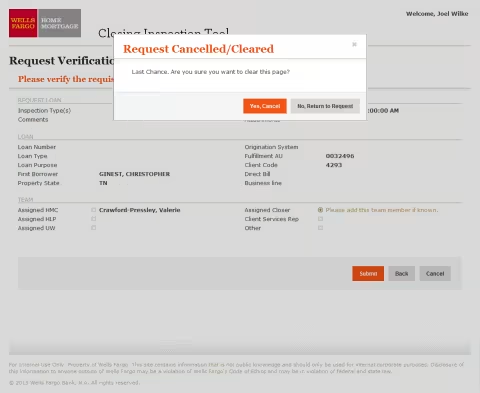
Rather than focusing only on the ideal path through the application, I incorporated validation and error handling into the wireframes and interface designs. I mapped inline validation, changing input states, contextual error messages, and alternate workflow paths so the design accounted for situations where information was incomplete, invalid, or required additional attention.

Extended the design system across products and platforms.
The template and visual language became a foundation that could be applied to additional products rather than remaining specific to the original mortgage workflow. I also translated the visual system into native Windows applications, combining Wells Fargo's custom branding with standard Windows form elements. This allowed different products and technologies to maintain a more consistent experience while still respecting the conventions and limitations of each platform.

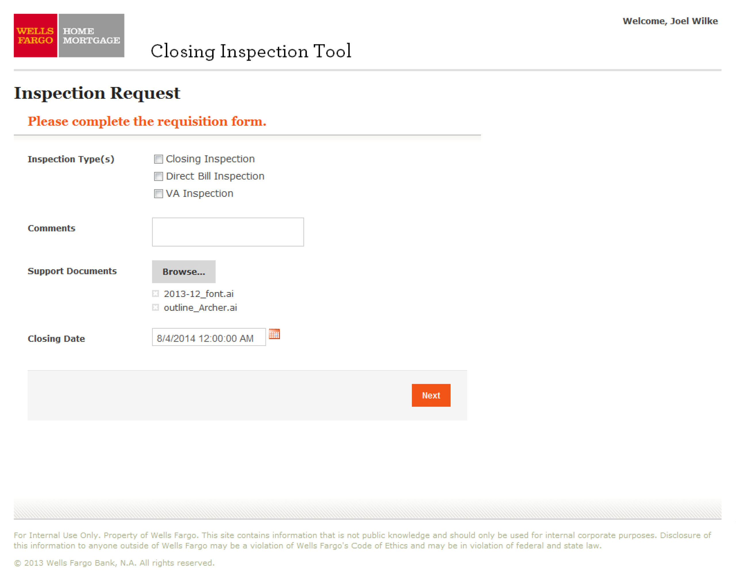
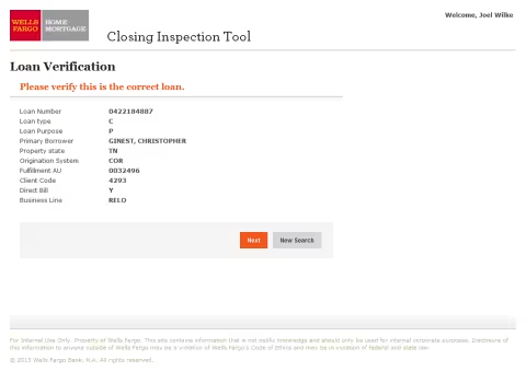
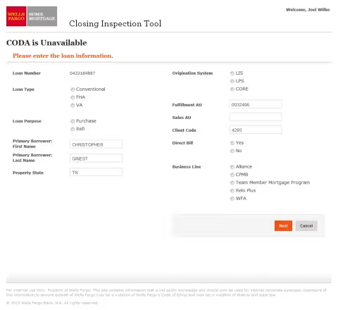
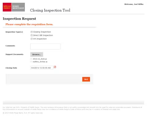
Closing Inspection Tool-Inspection Request screen
A process step screen during closing inspection

4. The Challenges & Handoff (Overcoming Friction)

Adapting the design handoff to the engineering team.
I found that traditional design specifications and spacing redlines did not always give the development team enough information to reproduce the intended layouts consistently. Rather than continuing to add more documentation, I used my front-end experience to create the structural HTML and CSS templates directly. This gave developers a working reference for the underlying layout and helped reduce ambiguity during implementation.

Balancing design intent with technical constraints.
The project involved a development team with varying levels of experience and a process that sometimes surfaced technical questions late in the workflow. When implementation proposals created problems for the intended user flow, I worked directly with developers to understand the constraint and explore alternatives. The goal was not to dictate a particular implementation, but to find solutions that preserved the important aspects of the user experience while remaining practical for the team to build.

5. The Result

The project established a reusable visual and structural foundation for Wells Fargo's internal mortgage applications. The original web template and interface patterns provided a starting point for additional products, extending the value of the design beyond the initial application rather than requiring each product team to develop its own visual and interaction conventions.

The work also demonstrated the value of combining design with front-end implementation knowledge. By creating working HTML and CSS examples when traditional specifications were insufficient, I was able to give developers a clearer path to implementation while maintaining the intended structure and visual hierarchy of the designs.

The project gave me an early and lasting appreciation for design systems as practical tools rather than simply collections of visual standards: a good system establishes enough structure that different products and development teams can build consistently without requiring the designer to reinvent the interface each time.

The legacy design

This comparison shows the evolution from the vibrant, high-density legacy interface to a more structured visual hierarchy. I reduced the number of competing colors and visual elements and introduced more deliberate spacing to make the information easier to scan and distinguish.

The resulting interface uses a restrained color palette, clearer hierarchy, and more consistent spacing to create a calmer working environment for internal agents. The visual language was also adapted to fit the established expectations of a large financial institution while remaining focused on the practical needs of employees using the application throughout the day.

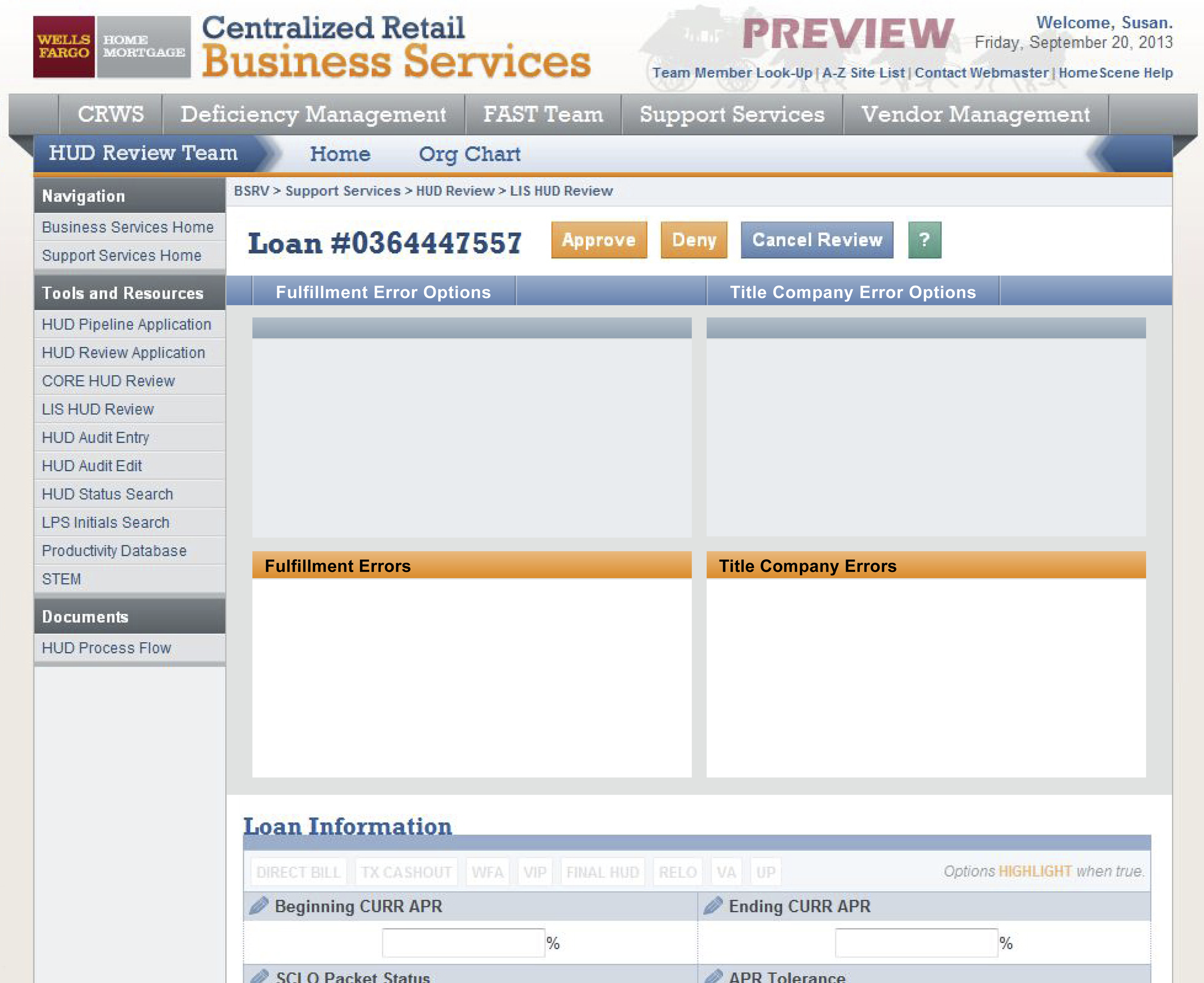
Screen design showing the previous design layout
Example of the department's previous design.